If you were among those who stormed to the cinema to watch the Barbie movie after it was released this year, then you should be conversant with the “I Am Kenough’ font.
It’s such a unique typeface that became very popular following the release of the Barbie movie.
During the movie’s promotional campaign, I noticed that the marketing materials had distinct fonts. They were playful and whimsical and totally embodied the essence of Barbie’s world of fashion, fun, and self-expression.
But that’s not the most interesting fact about this font. It also cleverly combines “Ken” who is Barbie’s iconic partner with “enough.” This combination further emphasizes the themes of empowerment, self-confidence, and the assurance that anyone can be “enough” as they are.
I think the font was generated as a part of the marketing and branding strategy for the film and it is also pivotal to its popularity.
Before now, Barbie was an iconic fashion doll that had been in existence since 1959. However, over the years, the doll evolved to reflect changing ideas of beauty, diversity, and empowerment.
The Barbie movie was a massive step toward championing these narratives and inspiring audiences to accept themselves as they are with confidence because they are always “enough.”
The “I Am Kenough” font was used in conveying these messages such that the movie posters, merchandise, and promotional materials were instantly recognizable to Barbie fans. I think the font’s playful and bold appearance was intentional to drive home the themes of self-assurance and self-expression.
There’s still more to the “I Am Kenough” font and I’ll reveal them in this article, from its characteristics to its unique features and how you can use the font in your project.
I will also show you examples of the font in action like DIY projects and social media posts.
Without much ado, let’s dive right in!
Also Read:
Characteristics of the “I Am Kenough” Font
A lot of attributes make up this font and I’ll explain them below.
Font Style and Appearance
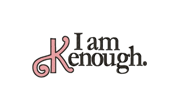
Image from doobeedooembroidery
Also Read:
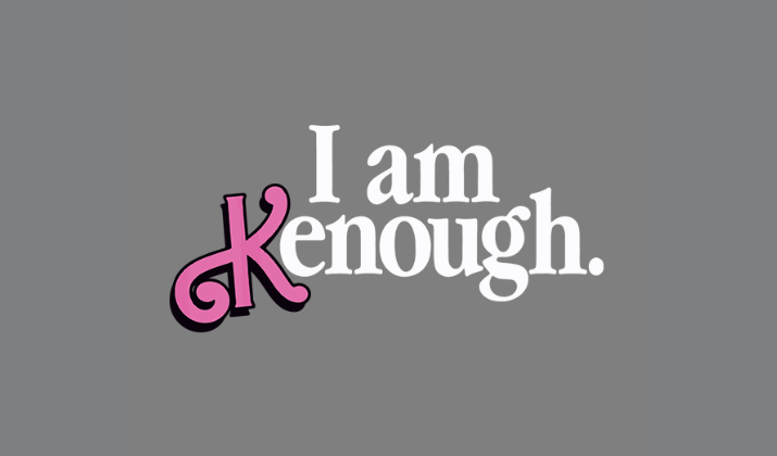
One major characteristic to notice about the “I Am Kenough” font is its slightly playful yet formal and simple design. I like how the letters are well-spaced and legible. This attribute adds a touch of warmth and familiarity to the font.
More so, I love that the font doesn’t shy away from being bold. The letters are thick and powerful, making them stand out.
In most cases, the font incorporates lively colors, like pink, which was the brand color for the Barbie movie. I think that the color helped to amplify its visual appeal and align it with Barbie’s colorful world.
Check Out:
Similarities to Other Fonts
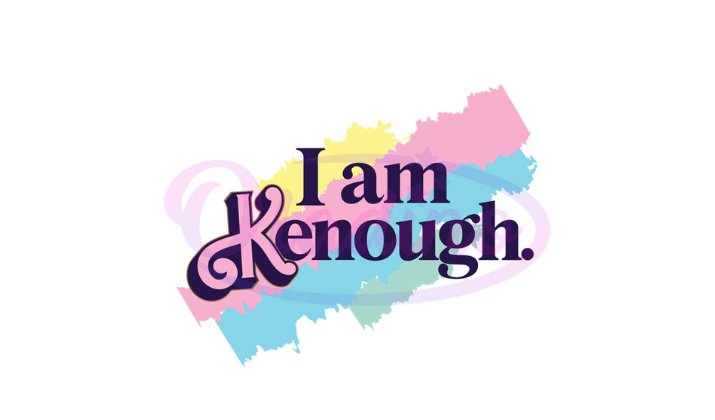
Image from oladino.com
Check Out:
As much as the “I Am Kenough” font has its distinct attributes, I noticed that it shares some similarities with the serif fonts mostly because it is highly legible and can be used in printed materials.
That’s one of the most prominent features of serif fonts. The fonts help guide the eye along the text, making it easier to follow the flow of words.
The “I Am Kenough” font also looks a lot like the sans-serif font due to its simplicity and lack of decorative elements. So, the fonts are readable even in digital media no matter how small they appear.
Additionally, like the sans-serif font, the “I Am Kenough” font has a neutral appearance that makes it suitable for conveying information without any distracting elements. It’s concise and direct.
The font is also digitally friendly and works well for social media platforms, especially TikTok and Instagram. Another similarity the “I Am Kenough” font shares with the sans-serif font is the timeless appeal it exudes. It will be used for centuries to come.
Now, let’s look at the unique features of the font and its connection with the Barbie movie and Ken’s character.
Also Read:
Unique Features of the “I Am Kenough” Font
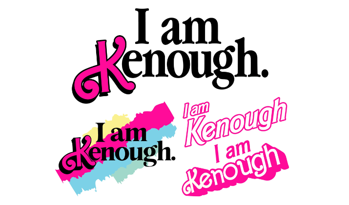
Image from etsy.com
Explore:
One of the key features that distinguishes the “I Am Kenough” font from other fonts is its close association with the iconic Barbie film. The font doesn’t have a traditional origin where an individual sits down to craft a particular font.
Instead, it rose and became a key font following the popularity of the catchphrase, “I Am Kenough” in the Barbie film. At the end of the film, we see Ken, played by Ryan Gosling, wearing a tie-dye hoodie that says, “I am Kenough,” which is a combination of his name with the word “enough.”
It’s a brilliant way to showcase his growth in the film, as he realizes that he is not just a fashionable accessory to Barbie and is enough as himself.
That’s the most remarkable moment that marked the end of the story but also engineered the new movement behind Ken’s character.
This movement became really popular across social media platforms, especially TikTok. In fact, I did a quick search on TikTok and discovered that the video posted by TikToker @mayreadingagain on July 21st, 2023 has over 11 million videos.
People were crazy about Ken’s hoodie because they wanted to embrace their own uniqueness and strength.
The hashtags “IAmKenough” and “Kenough” also went viral amassing millions of views on TikTok.
Also Read:
Now, let’s analyze how you can incorporate the “I Am Kenough” font into your designs.
How To Use The “I Am Kenough” Font?
Check Out:
From my research, this font is primarily used to convey a sense of empowerment and self-love. So, you should use it in projects where these themes are prominent. This can include motivational quotes, affirmations, and content related to personal growth and confidence.
The “I Am Kenough” font will also look great in projects targeting younger audiences, especially the Gen-Zs. It’s playful, yet legible, and conveys a sense of fun.
You should use it for children’s books, playful and colorful branding as well as creative marketing materials.
One of the ways to make the font stand out is to pair it with bright colors like pink, light blue, and yellow. Additionally, it’s best to have it on a minimalist background so it draws attention to the text.
Also Read:
Pairing The Font With Complementary Fonts and Designs
Because the “I Am Kenough” font is such a creative font, feel free to experiment with different variations of the font and pair it with other fonts to create visual diversity.
For example, you can blend it with a simple sans-serif font to provide more clarity and readability for your text. For depth and character, you can pair the font with serif or script fonts
Again, since the “I Am Kenough” font is bold and comes with rounded edges, it will be ideal to use it to establish a hierarchy of fonts within your project.
You can use the font for headlines, titles, or the key messages in your text to make them stand out, while the traditional fonts can be used for the body text for readability.
Overall, make sure that you maintain consistency in the font usage throughout your project.
Check Out:
Examples of the “I Am Kenough” Font in Action
I was deeply fascinated when I searched online and saw how the font was used both in DIY projects and in social media contexts.
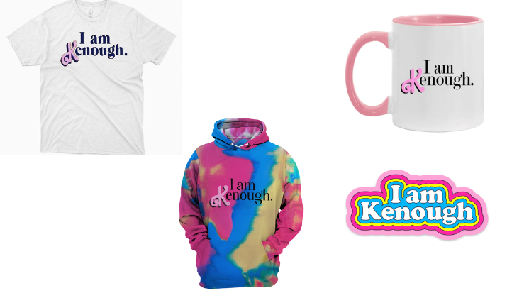
Some of them are custom t-shirts and hoodies with “I Am Kenough” boldly written on them. That concept spreads positivity and self-acceptance.
You’ll also see personalized mugs tote bags and accessories featuring the “I Am Kenough” font to inspire and remind people of their self-worth and uniqueness.
Explore:
- Best Writing Fonts For Cricut Card Making
- Best Helvetica Alternatives
- Best Fonts Like Bluey On Canva
Social Media Posts and Content Creation
A lot of people use the font to overlay quotes, affirmations, and inspirational messages on their Instagram photos and stories. They also create thumbnails for their TikTok videos.
It’s a good way to deliver positive messages or to participate in TikTok trends and encourage self-expression and empowerment.
Explore the best alternatives to Helvetica & Helvetica Neue here.
Conclusion
Overall, I’ll say that the “I Am Kenough” font has left a lasting impact on the world of design and pop culture. A lot of people gravitate towards this font because it’s neat, concise, and legible.
There’s a lot you can achieve with the font. So, feel free to explore as much as you can, especially in your creative projects.
Tom loves to write on technology, e-commerce & internet marketing.
Tom has been a full-time internet marketer for two decades now, earning millions of dollars while living life on his own terms. Along the way, he’s also coached thousands of other people to success.